12.31.2011

favorited

I added a couple of new baskets on etsy and then… came across these baskets. Which are lovely… and favorited by me. Très elegant in their simplicity. Her photography is inspiring, too.
In other news, I’m happy to report my etsy shop and a couple of baskets have been favorited by total strangers. Pretty amazing, right?
Here are the latest additions to trigonetsy.com:
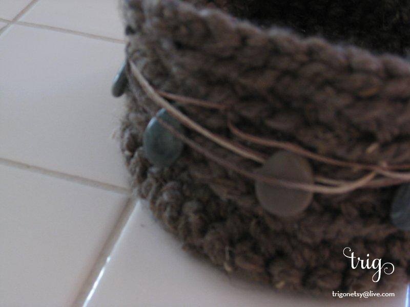
close-up image of off-white, chunky basket with hemp twine and green beads
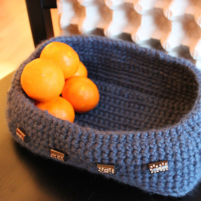
image of stormy ocean blue basket with bright orange tangerines

12.24.2011

lumps of coal

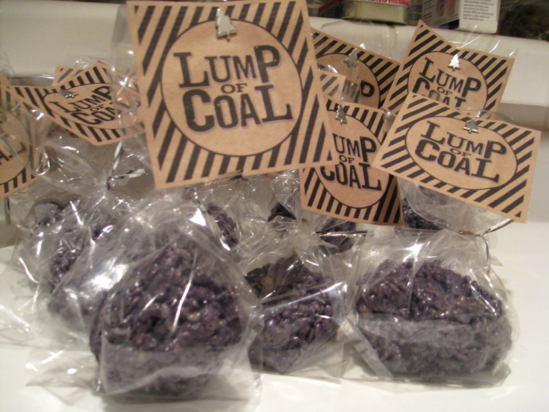
Loved the idea of “lumps of coal” for the kiddies this year. Maybe one or two big people, too. (Talkin’ to you, Bro.) Courtesy of eighteen25, they’re actually rice krispy treats died black… or in this case, an odd shade of grey-purple. I used the entire container of Wilton’s candy color and they’re not quite black. That’s okay, it will be fun to see the little guys’ reaction when I tell them Santa told me they were naughty this year… And then make it all better with their real presents. Merry Christmas to you and yours!

image of rice krispy lumps of coal in baggies

12.05.2011

raise your scissors


I hung out at the Urban Craft Uprising this weekend, Seattle’s largest indie craft show. It’s so fun to meet people whose shops I’ve admired on etsy. A little surreal, too. I mean, these people are uber creative and wow, they’re human, too. I could run on about the jewelry for a few pages, lots of beautiful, vintage inspired pieces. I ate a GF brownie and savory shortbread from Dolce Lou that were good enough to drop the GF from the title. And I encountered “shower art” for the first time. Waterproof, acrylic coated art with suction cups to hang in your shower. I’m thinking that’s a new niche with a lot of potential. Seriously.
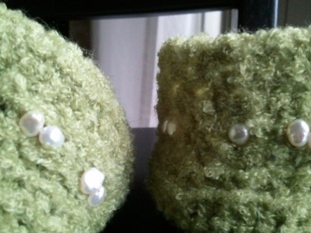
Coming soon to an etsy shop near you: a pair of petite baskets with freshwater pearl accents.
image: closely cropped image of green baskets with pearl beads

11.28.2011

holiday sparkle

I’m always a bit sad when the the brilliant colors of autumn fade into Seattle’s version of winter. There’s usually one good storm in November that tears the last of the leaves from the trees and then, gray. Gray skies, gray rain, gray mud. Until the day after Thanksgiving. Once that day arrives I assign myself free license to hang holiday lights and banish the gray for a few weeks. And banish I do. Lights adorn the fireplace and the bathrooms. There are nearly a thousand lights on my five foot tall tree. And lights greet me when I pull into my driveway each evening. Frankly it’s surprising the electric company doesn’t check up on us this time of year.
Three cheers for holiday sparkle!
image: blue and white christmas lights in a white sink

11.22.2011

the house scarf

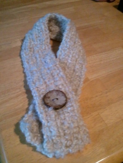
My mother is petite and slim and one of those souls who gets chilled. In the middle of the summer she requested a “house scarf”. About yay big, holding out her hands. “And not too thick.” Thick, in this case, meaning wide, further conversion explained. I set forth with a soft, fuzzy yarn and for kicks crocheted it the long way. The scarf is only 10 rows wide. Upon finishing it I realized it needed a finishing touch. A trip to the fabric store resulted in a big button made of coconut and I was feeling like I might need a house scarf myself. I admit, I tried it on. And function won over fashion when I added a small piece of Velcro as a way to to hold the scarf neatly against the throat.
I surprised her with it on her birthday and it makes me super happy she requested another. “One for upstairs and one for downstairs.” Of course.
image of house scarf

11.13.2011

ucreate for inspiration

Two trig thumbs up for the gals behind Ucreate – http://www.u-createcrafts.com/ – a daily blog that I actually read every day. They funnel fun crafting ideas and DIY projects from matchbook sewing kits to pallet walls to my inbox and the amazing creativety of the bloggers they feature never fails to inspire me. Today’s post is a challenge – make two of your next project you’re planning to give as a gift, and make a second to give to a childrens’ chairty. Do kids like baskets? Maybe a hat. Inspiration is oozing through me.

11.11.2011

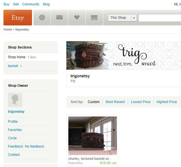
trigonetsy is on etsy!

When something you’ve been dreaming about and working on for months becomes real it’s pretty darn exciting. I feel  like my pooch when she learns she’s going on a car ride… running around in circles and jumping out of sheer joy. And so, with a drumroll, here it is:
etsy.com/shop/trigonetsy
screen capture of trigonetsy etsy page

11.03.2011

spectacular autumn

I’m sure the leaves are more vibrant this year than they’ve been in recent years. Is this our reward for suffering through an abomidably short summer? Whatever the cause, I’m appreciating it as long as it lasts!

10.30.2011

word documents are not images

I'm not sure how this phenomena started but really, it needs to end. If someone asks you for an image they mean a photograph or a vector file. Not a Word document that has a photograph pasted into it. Or a PowerPoint file with the image pasted in. Or a PDF file. Or a Publisher file. They want an image file.

Granted, digital media is overwhelming. There are tons of different file types and when you throw compression into the mix it's like trying to comprehend chemistry in Latin (for those of us that don't speak Latin). Here's a breakdown that should give anyone in an office environment the know-how to provide the right image file for any occasion.

We'll begin at the beginning, what is a digital image? There are two types: vectors and bitmaps. Very generally speaking, in office settings you will come across logos as vectors and pretty much everything else is a bitmap.

The fancy-schmancy image type that a lot of graphic designers use are vector images. The information that makes up an image is stored in a set of directions a computer understands called algorithms. The great thing about vector art is the ability to re-size it without any loss of image quality. If you want to change your post-it note size image into a billboard, the algorithm recalculates everything and voila, you have a billboard sized image.

The other type of image, a bitmap, is what you get when you take a picture with your digital camera or save a picture from the internet. Bitmap images are made up of lots of tiny squares called pixels. Imagine a grid and different color "bits" filling all the squares. Lots of those tiny bits run together and your eyes process an image. Remember, remember, always remember, you can't add more pixels. Whatever you have, you're stuck with. A bitmap image can be made smaller, not bigger. If you make it bigger it gets "pixelated" which means you have jagged lines where edges of the pixels are showing up and the picture looks like crap ( yes, that's the graphic-industry technical term).

The key to understanding and using bitmap images is resolution. When you see "dpi", it is referring to the resolution of an image or the "dots per inch". If you're looking at 10 dots spaced evenly in a square inch they are far enough apart to see each dot individually. This would be poor, poor resolution. Picture a few more dots in the square. Images on the internet usually have 72 dots per inch. That is about the least amount of dots you can have in an inch that your eyes process as a reasonable quality image rather than individual dots. Now jump ahead and picture that same square inch with 300 dots filling it in. You can't make out individual dots at all, right? Your eye sees a nice smooth transition between colors. Resolution boils down to how dense the pixels are in your image. What should you remember out of all this? Resolution tells you the quality of your image. 72 dpi is small, suitable for electronic needs. 150-200 dpi is probably the resolution your office scanner is set to zap in documents at. 300 dpi is the minimum quality a professional printer will accept.

Where does all this leave you, esteemed office worker? Let's say you're lucky enough to have a few different versions of your company's logo. This is what they're good for:

companylogo.EPS - This is a vector file. If your graphic designer or printer asks you for a copy of your logo, this is what you send them (if you're lucky enough to have one).

companylogo.JPG - If you don't have an EPS file you can use a JPG file if the resolution is at that 300 dpi level I described before. Here's the trick, you may not have software installed on your computer to know what the dpi is. Look at the size of the image to get an idea. If it is measured in KB (kilobytes) the quality is too poor for use by a printer. If it is measured in MB (megabytes) you're probably good to go. This is the file you'll want to use when you are working on reports and things, too. The easiest way to check the size of an image is to attach it to a blank email and send it to yourself. Don't delete the KB-sized JPG though, that's the version you will use online or in your email signature.

companylogo.GIF - Typically used to save an image that has a transparent portion. GIF files are small and good for using online if your image is clipart. Don't try to save your vacation pictures as GIF files, it won't be pretty. GIF files are small because they have a trick of condensing colors. Your vacation picture of a glorious sunset over the ocean that has millions of different shades of pinks and purples will be converted into a picture with a couple hundred colors. Not quite as glorious.

Real-life scenario, supergirl: I email you asking for a picture of your boss to put on an invitation. What do you send me? NOT their PDF or Word resume that has a picture in it! Let's work this out together. I'm asking for an invitation and you don't know if it will be going out via mail or email. You could ask me what my needs are, I'd be happy to tell you the invite will be sent electronically and via snail mail. Since you can't make a small image higher quality it would be best to send me your MB-sized JPG. It is big enough to print on an invitation and I can make it smaller for an electronic invitation.
10.27.2011

scrambled eggs for lunch

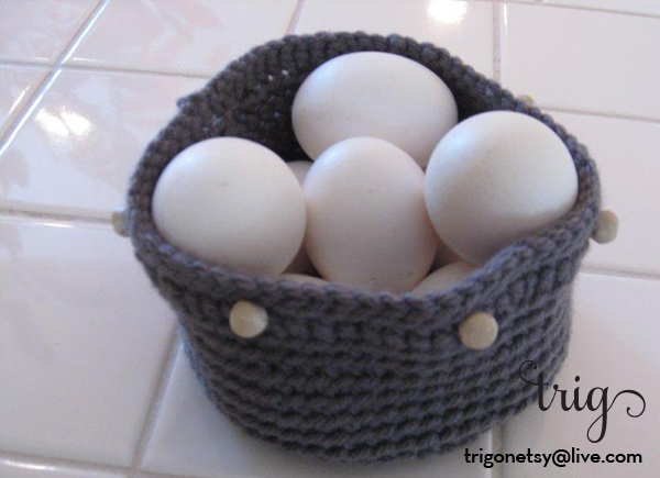
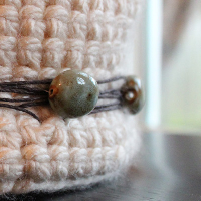
I really love this basket. The color of the yarn reminds me of one of my best friend’s eyes, a pleasing shade of grayish blue. The texture of the yarn is perfect for a crocheted basket; strong enough to keep it’s shape and soft to the touch. The accent row and the wood beads finish it off nicely. That’s not why it warrants it’s own post. The funny part of the story is, yes, there were egg casualtes in the making of this picture. I knew it was going to happen when I took the eggs out of the fridge. Do I stop myself and say hey, self, do this another day. Noooo. Of course not. I prayed the eggs wouldn’t break in the basket. Thankfully, none did. I had scrambled eggs for lunch that day.
blue-gray basket, wood bead accents, filled with eggs

10.18.2011

cozy scarf

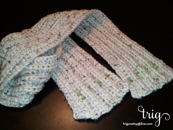
I picked up some nice, thick yarn at the craft store and knew immediatley I had to make a scarf. Sure, there’s a wacky corner on one side, I call it ”character”. I also blame the cat. I find it’s hard to tell if my edges are straight when I’m crocheting over my head because the cat is circling around in my lap endlessly. Then there’s the point that I sometimes forget I’m short so it’s too long, but I’m pleased with it nonetheless. The little sparkle of beads makes me happy when I see them accidentally.wool scarf with beads

10.13.2011

display shelves

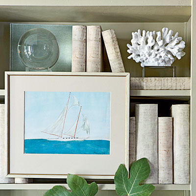
Coastal Living is my favortite magazine. I always get a vibe when it’s in my mailbox. The latest issue – Nov 11 – has some fun ideas for turning bookshelves into display shelves. I like the way they stack art and book ends on top of books that are lying down.
Hanging small pieces of framed art on the shelves themselves is brilliant – cost effective and they can be replaced by fickle souls like myself who like to change things every couple of months. Probably won’t go so far as wrapping my books in paper, after all, I have the books for a reason and would like to be able to find them. Overall, the ideas get an A+ plus for supergirl status.
image of bookshelf with framed art

10.05.2011

what are you eating?

What are you eating?! You'd be surprised how often I get this question. I work in a Better Off Ted style office and most of my coworkers eat Lean Cuisines for lunch and dinner. I guess that's why they can't identify my food - it's not precut, precooked and prepackaged. So, to save cubicleland from a sodium overdose, let's take a look at supergirl's lunch.

Pretty basic, bread, cheese, spinach, cucumber. What makes it supergirl worthy? 1) Superfast to prepare. 2) Doesn't bust the budget. All of the ingredients can be picked up at Costco and brought to work on Monday. You'll have plenty for lunch everyday AND you don't have to remember your lunch the rest of the week (did I mention my middle name is "efficient"?). Details: the bread is organic whole sprouted wheat, I like Silverhills Bakery "Squirrelly" bread. You can't tell it's sprouted, it tastes like a nice, nutty wheat bread filled with good-for-you fiber and other nutrients that usually get chopped out. Cheese, havarti is my favorite, I switch it up with cream cheese or low-fat Swiss. Pre-washed spinach (gotta get your iron supergirls) and baby cucs top it off. Slice the cucumber the long way to look extra fancy. I'm not an expert, but all-in-all you're looking at a 400+ calorie lunch that is packed with protein and fiber. What are you eating?

9.28.2011

my first basket

Many moons ago. Many, many. My Mother devoted a fair amount of time teaching me a variety of sewing crafts, including crochet. It didn’t take. I’ll sew a loose button on here and there, but no one is surprised if, say, I need something hemmed and ask for her assistance. And when I say assistance I mean ask her to do it. So when I picked up a crochet needle in the not too distant past it came as a surprise to both of us that her instruction was not wasted. My first basket sits front and center on our media cabinet and holds Netflix DVDs. It’s not perfect. Obviously, the basket should be holding diamonds but hey, at least the DVDs are neat and tidy.
image: basket, brown, beads

9.21.2011

trig – neat, trim, smart

trig definition, neat, trim, smart
Unlike the proverbial four-letter word, this little guy is far from profane. Trig. Neat, trim, smart. Who doesn’t want to be smart, or neat? And trim, we’re talking Jackie Kennedy, polished to a T and always looking good, trim. Call me crazy, but this little word inspired me to share my creations with the world. I think they’re trig, I hope you do, too.

6.01.2011

long live sticky notes

As a kick-ass Supergirl you’re BUSY. Me, too. And when my to-do lists are overwhelming I go on the hunt for a new and/or better time management technique (not the most efficient path, but more on that later). Recently the articles all seem to be some variant of David Allen’s “Getting Things Done”. In the cubicle-land that I work in its safe to say at least 10% of the population has their Master To Do List with them at all times. Whether they carry a mead spiral bound, a moleskin or their blackberry, action items are duly recorded.

If you haven’t heard of Getting Things Done one of the characteristics is to consolidate all of your to-do lists in one place. The very simplified theory behind this is you 1) get peace of mind because you always know where to look for your notes and 2) since you know what all your tasks are you can make efficient decisions about what to work on at any given time. The entire system of Getting Things Done is more complex, I’m taking a moment to focus on the to-do list. I loved the idea of consolidating my lists. At least once a month I leave my grocery shopping list on the refrigerator or lose my homework assignments in a textbook. Because I knew this system would work I went straight out and bought a little notebook with a clasp and attached pen. Obviously the 25 other notebooks I have stashed around the house were not good enough. The Master To Do List was going to streamline my life. And it worked! For three weeks. Inevitably I would leave my cute little notebook in my purse or somewhere equally inconvenient for scribbling a note to myself. I have to admit, I gave up on the idea pretty quickly. Old habits die hard.

Until I had a brainstorm. The sticky note. They’re everywhere. Work, home office, kitchen, heck, I even have some in my exercise room (don’t ask)… My brainstorm merges the best points of lazy note taking and the efficient consolidated list. Wherever I may be I jot my notes down on sticky notes. When it is convenient I pile them up and bring them to my notebook. All my tasks end up in one place and they’re easy to organize to boot. Priority change on a project? I’ll just move that sticky to the front page. Need to make a couple of phone calls? Peel those stickies out while I’m sitting in traffic and make the calls. Can you tell how pleased I am with myself? And a pleasant side effect is my monitors don’t have a multi-colored frame reminding me of how busy I am.

5.26.2011

less is more in PowerPoint

We've all seen them, endless PowerPoint slides filled with multiple levels of bullet points. The entire speech is posted for the audience to read and then squeeze in a little shut-eye while the speaker finishes. From an aesthetics standpoint, blah. More importantly though, the speaker is doing themselves a disservice. Instead of being the superstar the speaker is sharing the spotlight with a direct competitor, the PowerPoint slides. The human mind cannot process visual and audio input at the same time. Each time the speaker puts up a new slide the audience shifts their focus from the speaker to the slide. It is in the speaker's best interest to offer a slide that can be interpreted in a split second so the entire audience shifts their focus back to the speaker. How does supergirl accomplish this daring feat? It won't be easy. Boring PowerPoint slides have been entrenched in office culture for decades. Move slowly so you don't scare anyone with your radical ideas:

1. The speech, slides and handout are 3 different things. Repeat this with me: three different things. The speaker should have a speech, a few slides to underscore key take-away points and a handout applicable for the task at hand. Supergirl hint; if you don't already know how to use the notes feature, open Help in PowerPoint and do a keyword search for "add notes".

2. Start each PowerPoint presentation from scratch. Avoid reusing old files as much as possible. Opening the old files gives the speaker permission to recycle all of those slides and you lose a lot of ground.

3. There is no law commanding each slide to have a title and body. Remember, key take away points that can be interpreted by the audience rapidly. One sentence, max. Seriously, if you can make it shorter, do it. The speaker should be in the spotlight, not the slides.

3.08.2011

how to get noticed - for the right reasons

"Nice Girls Don't Ask" observes the phenomena of men asking for what they want and women not. Working hard and hoping you'll get noticed is for weenies. Supergirls get noticed, ask for a raise and justify their request.

There are two tactics for getting noticed. First, talk to your manager or coach. Talk to their boss. Keep it professional and get to know the people that will be your advocate when it's time to decide who receives a raise or bonus. Second, track your successes and share them with your boss. You're not bragging, you're informing. This is the sticking point alluded to in "Nice Girls Don't Ask". Men don't share the stigma women have of letting people know their successes. Men tell their boss they got a fabulous client or saved the firm a bunch of money.

People who don't "toot their own horns" are destined to be overlooked. You don't have to be in your boss' face. If your boss is formal and likes processes a quarterly meeting would be appropriate. A quick email may suffice for a casual boss. If you're not sure, ask! "Boss, I'd like to keep you updated on my successes without burdening you. Would you prefer to schedule a regular meeting or should I send you an email periodically?" Your boss will notice you are being considerate of their time. Keep a record of your wins. Brief so you continue to update yourself. The date and a sentence or two should be enough, "10/2/2009; Ordered 20,000 sheets of letterhead instead of 2,000. Will save company $5,000 over one year." This will come in handy at review time or when you are dusting off your resume.

How you communicate to your boss is a means to an end. The goal is to make a business case for why you deserve a raise. Know your facts. Find out what comparable positions earn in your area. Have a conversation with your boss, not a debate. Refrain from bringing up financial hardships, your personal life is outside the business case. Likewise, don't mention leaving the company if you don't get the raise. If you do bring the subject up be fully prepared to act on the threat.

All of your preparation is for nothing if you don't ask for the raise. Ask your boss for a meeting to discuss your salary when s/he is calm. You don't want to start off on the wrong foot by bringing the subject up when your boss is dealing with an emergency. Once in the meeting maintain a professional demeanor. If your boss cites budget restrictions, offer alternatives to a monetary raise. Be creative with other perks you would accept in lieu of money such as a monthly bus pass or your dry cleaning being paid for. If this is a company you enjoy working for don't let a refusal bring you down. Ask your boss what would justify a raise or a promotion - then get yourself noticed for all the right reasons.